.jpg)


Industrial Communcations
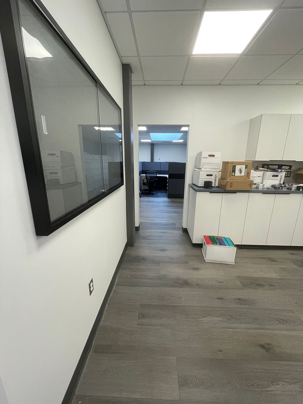
When a previous renovation missed the mark, this client came to KR Architecture and Interiors for a workplace that actually worked — and looked like them. We reworked the floor plan for better flow, new furniture and cubicles, a new entry, a conference room, and refreshed C-suite offices.
The bigger win: a space that finally reflects the brand. Blue accents from the company logo run through the design with intention, not overkill. A custom illuminated screening panel adds privacy along the main corridor while nodding to the company's lightning-bolt mark — one distinctive feature that gives the whole office energy.
We also tackled what you can't see: added wall insulation and replaced deteriorating glazing. The result is an office that's sharper, more efficient, and finally something the team is proud to walk into.




Categories:
Commercial, Renovation, Interior Fit-out, Office, Interior Design